Ana Tudor asked this morning about using the Chrome DevTools for testing CSS performance:
Chrome's performance tools have come a loooong way in terms of measuring performance on all sorts of scales, so I figured I'd take this opportunity to dig in and better educate myself on how to use them. What follows is the result of my endeavor to figure out what these graphs and charts mean. 😬
TL;DR
Honestly, I'm not sure the Performance tab has that much to offer in terms of debugging CSS. It may be able to help define the when, but from my cursory dive I don't see it helping me identify the why. If others have more insight, I'd love to have somebody prove me wrong. 🥰
Okay, what are we looking at?
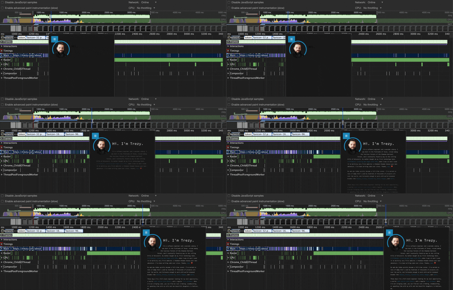
This is a screenshot of the Chrome DevTools on the about page. This page has a decently meaty animation when it loads up, so I figured it'd be a good place to test this stuff out.

The Timeline
The first thing I did was try to understand what each section of the Performance tab is for. I started with the timeline at the top of the pane.

The timeline looks super interesting. At first glance, it seems like it's able to enlighten me with all sorts of valuable data. At second glance, I realize I find it *completely unintelligible. After clicking at random and hovering around a bit, I think I was able to glean some details on how to use it to track performance.
First off, you can grab the handles at either end of the timeline and drag them in to minimize the amount of data that's currently under analysis. This alters what you see in the rest of the tab, too.
Second, Chrome seems to have recorded what the site looks like as it renders. Hovering over any point on the timeline will show you a thumbnail of the site at that precise moment. This feature is what we in the industry often refer to as hella cool.

I've now minimized the data under analysis by using the thumbnails and pulling the handlebars to the beginning and end of the animation I'm wanting to analyze. 😎
The... Other Timeline?
Okay, so below the complete timeline is another timeline with much more in-depth information. Again, this looks super useful, but I'm not entirely sure what to make of it. One thing I will say is do not scroll while hovering this timeline. It turns out that scrolling adjusts the selection in the full timeline up top. FML.
Okay, I'm going to try to reduce scope so I only have to understand a part of this, rather than the whole thing. First thing, I'm going to disregard the Network, Timings, Chrome_ChildIOThread, and ThreadPoolForegroundWorker. I'm sure they're all useful, but they don't seem immediately related to what I'm interested in.
Clicking the arrow to open the Main section is... holy cow it's noisy. When I hover over it I see a lot of things like Schedule Style Recalculation and Recalculating Styles (I really want it to say Reticulating Splines in here somewhere...), so I'm sure this something I'm going to dig into, but I'm going to put it off until last. The other pieces look way less noisy.
Opening the Raster section, I feel like I'm getting somewhere. I see two things underneath it — Rasterizer Thread 1 and Rasterizer Thread 2. With all this talk of threads, I suspect this whole graph is about the browser's processor utilization. Most of these categories are probably related to the CPU, though there's a separate section specifically for the GPU that I'm excited to get to. Anywho, the Raster section. By definition, rasterization means:
"to convert into pixels for screen output; convert into a raster image" via The Free Dictionary
So this is very probably referring to the browser taking already generated images and preparing them, pixel-by-pixel, for rendering.
Next, I'm going to skip down to the Compositor section. There's only a single timeline underneath it. Compositing generally refers to taking two or more things and combining them to make a single thing. I'm guessing this is the browser taking the different pieces chunks of DOM, positioning them appropriately, then sending them as a single hunk to the Rasterizer to turn it into an image that can be rendered.
The GPU section is actually kind of disappointing. Similar to the Compositor, it's a bunch of blips on the timeline with no description. I was hoping it would give me some detail on what operations it was passing off the GPU, but nah. 😞
The Overview
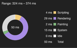
Finally, we have the donut chart at the bottom labeled "Summary".

Looks like this is a breakdown of how long each of the performance heuristics that we're tracking took in total. Let's break down the legend here:
- Scripting - It seems safe to assume that this is tracking the page's execution of JavaScript.
- Rendering - I'm guessing this is a combination of both DOM rendering and CSS rendering.
- Painting - I'd wager that this is related to CSS repaints, but honestly I'm not sure what the difference between rendering and painting is. We'll have to look this up next.
- System - Probably OS-level things like garbage collection.
- Idle - Time that the browser isn't doing anything or is waiting for something else to finish.
Conclusion
So, I think all of the pieces of the timeline could be really valuable, but you still have to do a lot of work by hand. If you're working on some clunky CSS animations, the timelines could be super helpful to identify when your animation is getting wonky, though it doesn't seem to have any insight into why it would be happening. The overview seems really valuable for getting a quick look at the resources your app is using within a certain window, but I'm not sure that I'm going to be using it anytime soon.
One other resource that may be useful when you're digging into CS performance is the CSS Triggers website. It details which types of CSS rendering operations (Layout, Paint, Composite) will be triggered when changing each CSS property. You could use this — in conjunction with the Performance tab and looking at the styles on your elements — to try and narrow down what exactly is causing your animations to be clunky.